
ENTERPRISE SAAS • B2B • DATA VISUALIZATION
NICE Supervisor
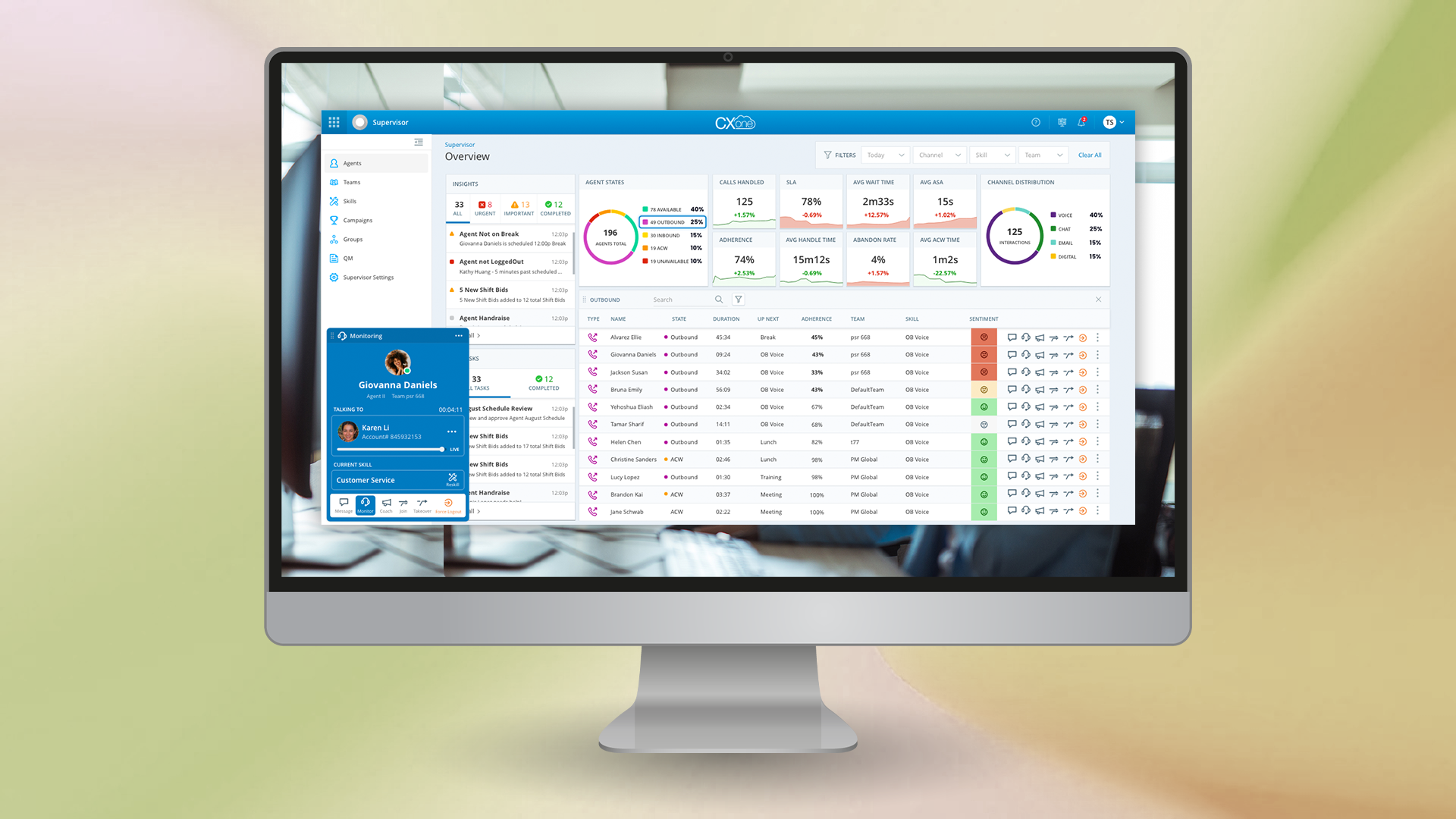
Designing the real-time operations hub for contact center supervisors unifying agent monitoring, live intervention, and AI guidance into a single scannable surface.
ROLE
Senior UX Designer
TEAM
1 Senior UX Designer, 2 Jr. Designers, 1 PM, 2 UXR
SCOPE
Workflow research, affinity mapping, KPI card system, interaction monitoring flows
PLATFORM
B2B Enterprise SaaS, Desktop, Supervisor Dashboard
OVERVIEW
Contact center supervisors are responsible for real-time performance across large agent teams in monitoring live interactions, responding to workforce exceptions, intervening when agents need support, and tracking SLA across multiple queues simultaneously.
The existing toolset was fragmented. Supervisors switched between separate views to track agent states, respond to alerts, and step into live interactions. Every context switch added latency to decisions that needed to happen in seconds.
The goal was to unify these workflows into a single, scannable surface. One that gave supervisors immediate situational awareness and the ability to act without losing sight of the broader team.
PROCESS
Workflow research & mapping
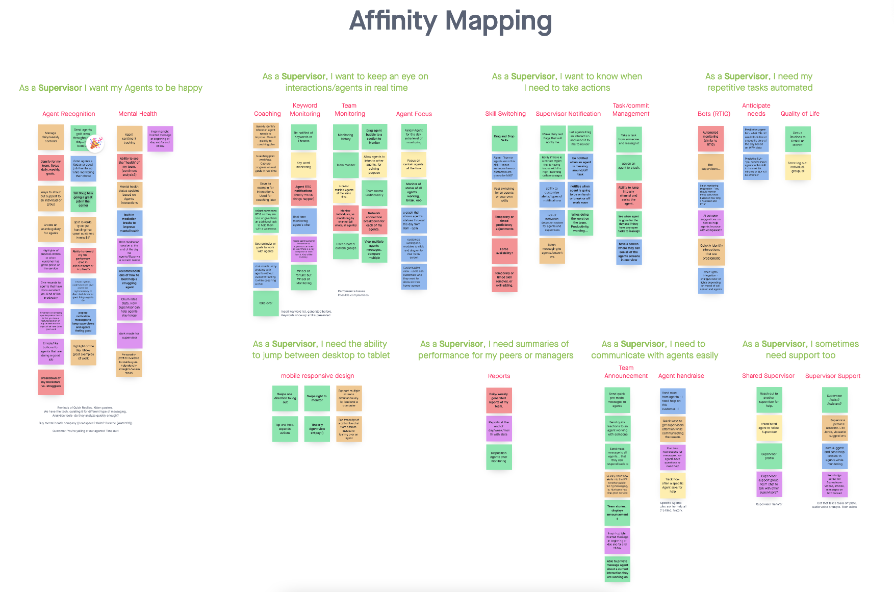
Workflow research was conducted with contact center supervisors. Mapping how they spent their time, what triggered intervention decisions, and where friction was highest. Through affinity mapping, the core exception-handling patterns were identified: agent state anomalies, SLA breaches, escalations, and shift adherence gaps.
These patterns became the foundation for the dashboard's IA. The dashboard needed to surface what was wrong, what was next, and who needed help without making them look for it.
Flexible KPI card system
Different contact center clients prioritize different metrics like service level (SLA), average handle time (AHT), CSAT, abandonment rate, queue wait time.
Rather than prescribe a fixed layout, the dashboard has a flexible KPI card system that supervisors could configure for their team or campaign priorities. Each card supported trend data alongside current values, giving supervisors both a snapshot and directional signal in one glance.
Queue-level SLA views were integrated directly into the dashboard, so supervisors could see top and bottom performers across skills without drilling into a separate report.
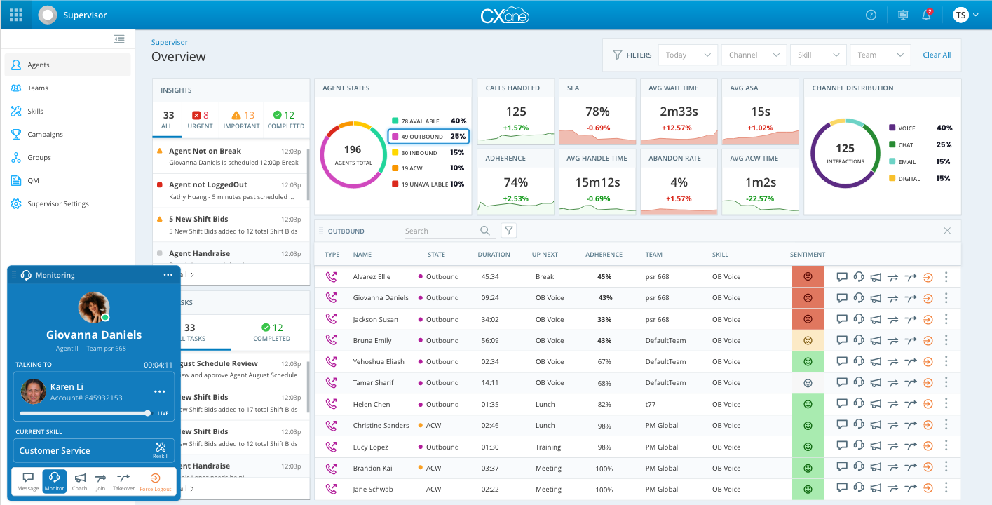
Overview view: configurable KPI cards, agent state donut, channel distribution, and queue SLA at a glance.
Integrating AI guidance scores
One of the most technically distinctive aspects was surfacing Real-Time Interaction Guidance (AI Copilot) scores at the supervisor level. RTIG generates AI coaching signals during live calls like empathy, rapport-building, effective questioning. This layer was designed to see which agents were receiving top and bottom guidance signals in the past hour.
The design provided supervisors visibility and prioritization in coaching interventions for their agents struggling with the actual quality of live customer interactions.
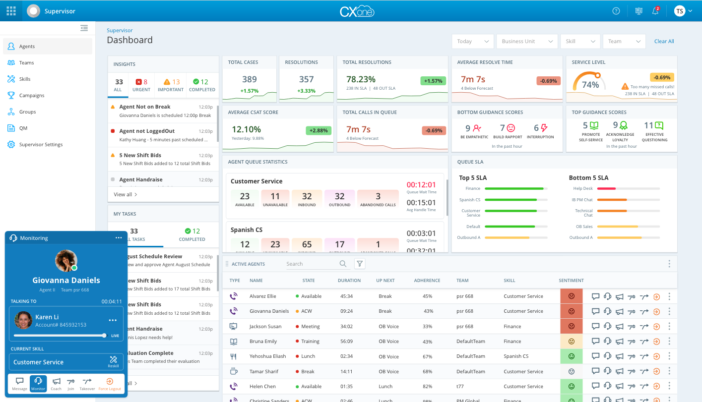
AI guidance scores integrated into the supervisor layer — top and bottom RTIG scores surfaced alongside operational KPIs.
Monitoring, coaching & intervention flows
The most sensitive design challenge was the intervention layer. The flows that let supervisors monitor, coach, join, or take over a live interaction without disrupting the agent mid-conversation.
These were designed as as contextual and progressive actions available directly from the agent row: silent monitoring first, then coaching (whisper to agent only), then join (three-way), then takeover if needed.
Each state was visually distinct, with persistent context bars that kept the supervisor oriented across the active interaction. The goal was a system that felt like support, not surveillance.
Maye’s Contribution:
Designed the first unified view surfacing RTIG (AI Copilot) coaching signals at the supervisor level, letting supervisors prioritize intervention by agent guidance scores rather than static reports
Conducted workflow user research and affinity mapping with practicing supervisors to define the core exception-handling patterns (agent state anomalies, SLA breaches, escalations, adherence gaps) that shaped the dashboard's IA
Established monitor → coach → join → takeover as a progressive, low-disruption intervention interaction pattern, later reflected in NICE's broader Supervisor Workspace and Copilot for Supervisors products
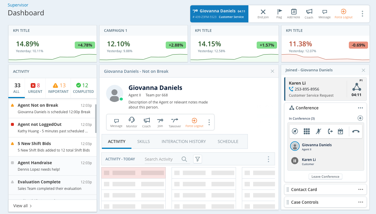
Join/conference state: supervisor joined a live call with contextual conference controls and full interaction history accessible.
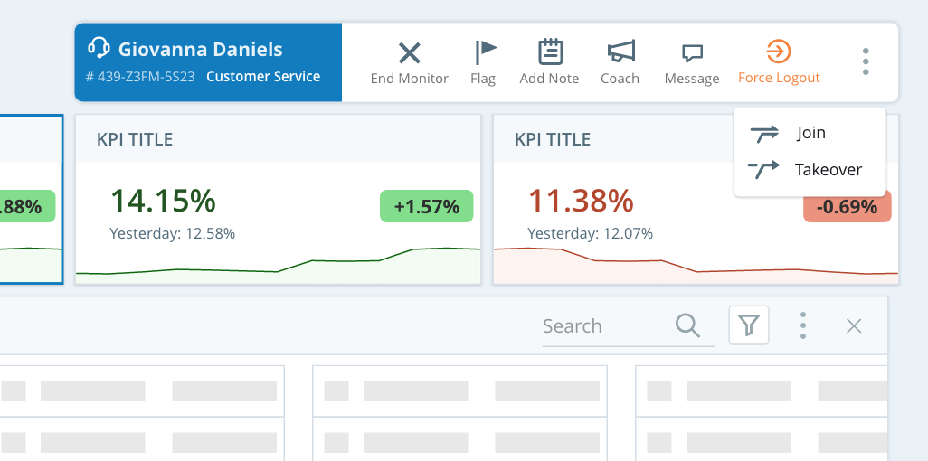
Takeover flow: supervisor assumes control of the interaction with clear end-state actions and minimal visual disruption.
SELECT OUTCOMES
NICE customer Republic Services, later reported a 120% increase in coaching actions within three months and a 33% improvement in customer sentiment within six months (Frost & Sullivan, 2024)
30%
reduction in negative to extremely negative customer sentiment
120%
increase in coaching actions in 3 months
30%
reduction in repeat calls